Make the data * pop *
By visualizing information, we turn it into a landscape that you can explore with your eyes, a sort of information map. And when you’re lost in information, an information map is kind of useful.
― David McCandless
True data driven decision making is one of the most important skills in existence, and getting a good grasp of your data is obviously extremely important. This post features some of the various ways I have visualized data so far, including statically designed diagrams as well as fully interactive prototypes.
Habit Tracking
To get a visual grasp of my habits throughout the year, I designed this visualisation:
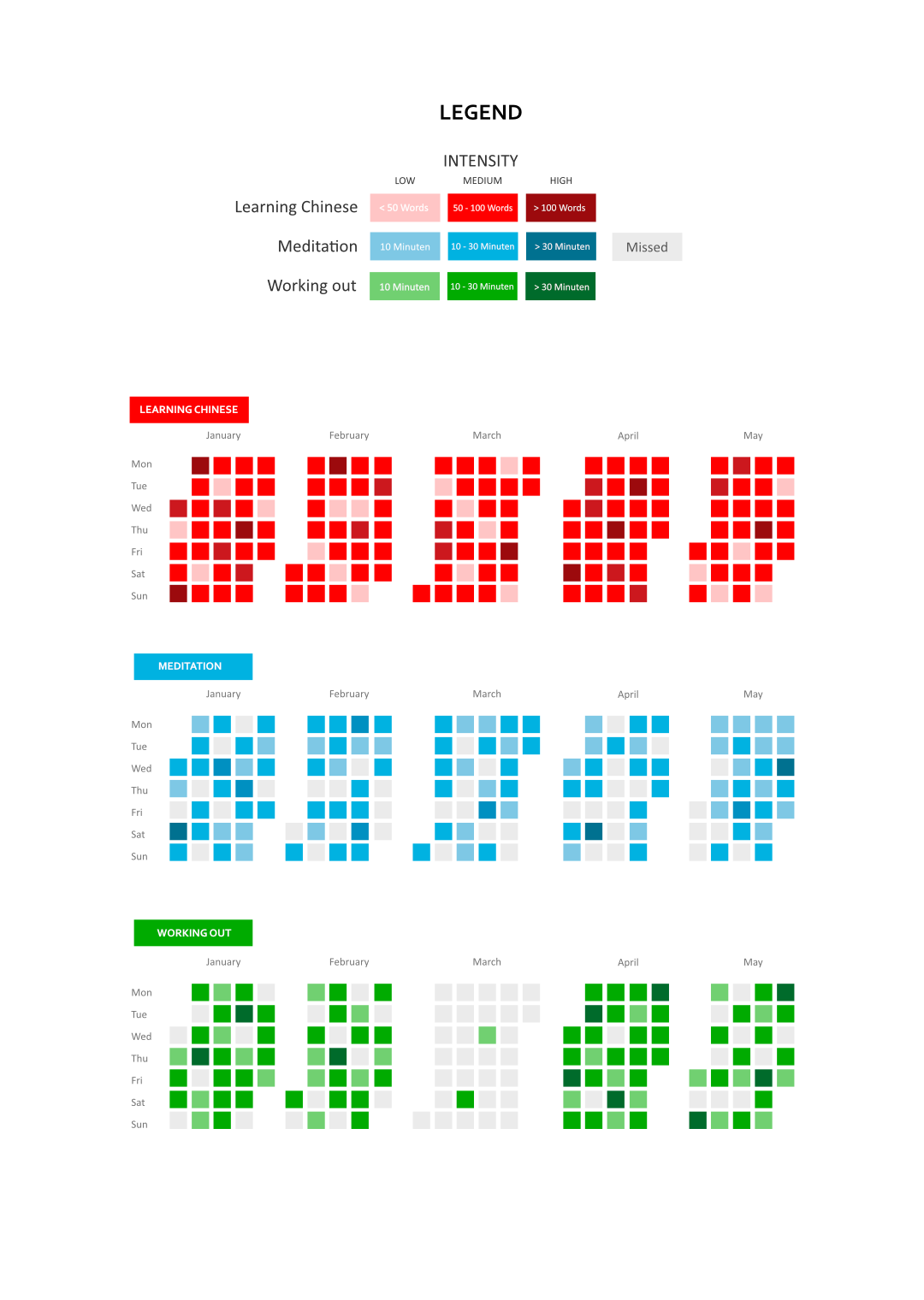
The idea behind this design is taken from the popular GitHub contribution tracker. Every day is represented by a box, the color indicating both the kind (learning Chinese, meditation or working out) and intensity of the contribution (in this case, words studied / time of meditation / time of work out). This way, lots of information is processed in parallel and you get a good grasp of the various tendencies, like the streak of days where the activity was performed, how strongly it was done in general or in certain periods of time, etc. You can even compare week days, weeks and months pretty easily by scanning horizontally, vertically or by group of boxes respectively.
I also designed this visualisation:
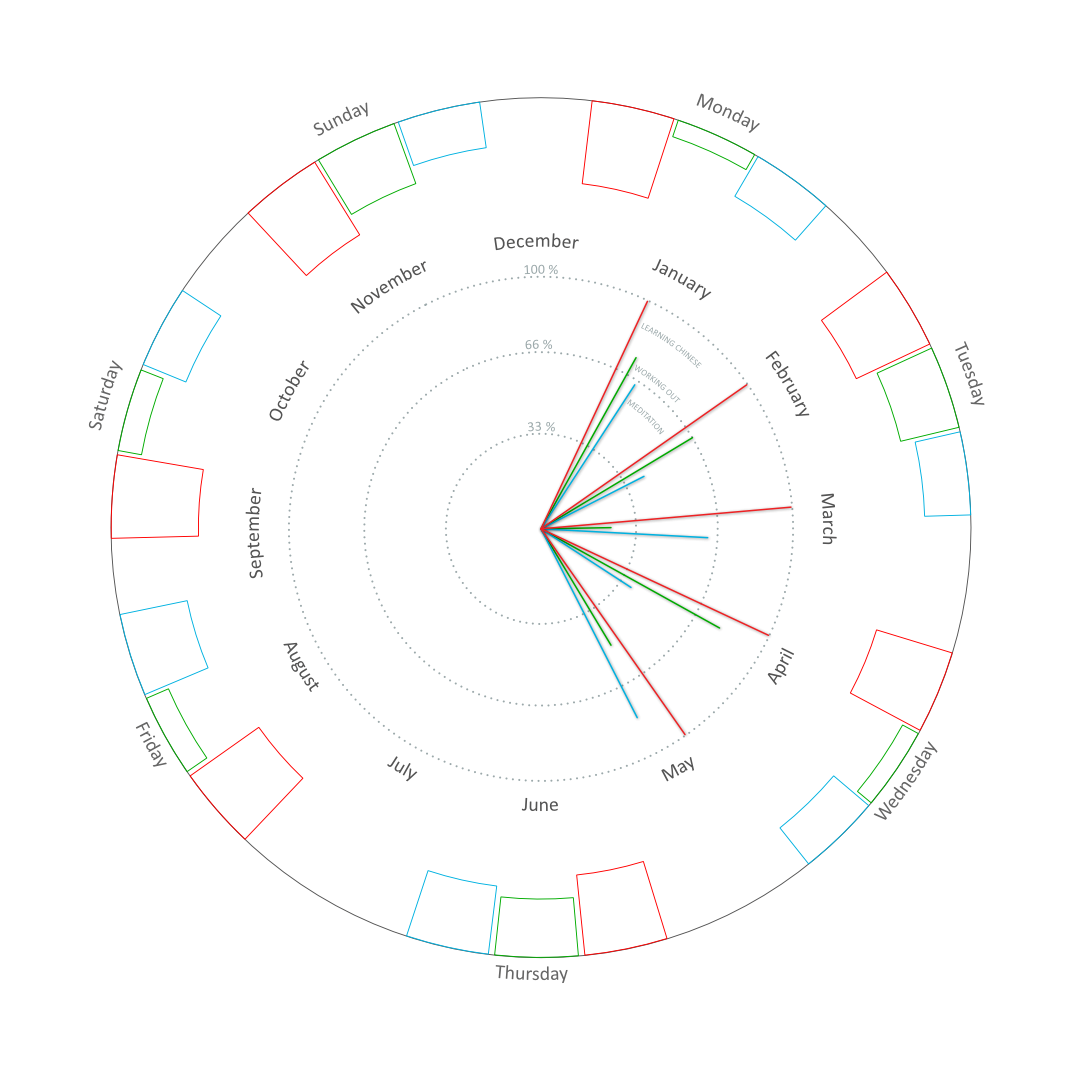
While it is pretty aesthetically pleasing to me personally, the information it offers at a glance does not compare to the version above. Color in this case only represents the activity, the intensity is given by a line’s length or the height of a “bar”. It is much more difficult to understand and draw value from, especially since the round shape in this case makes comparisons hardly possible. I included it nonetheless, to illustrate how appearance is obviously not everything. Deep.
HCI @ University: Overview
To inform others about the degree I am working towards, I created this interactive prototype.
This was actually the first Axure prototype I ever created! It features multiple types of charts and custom diagrams to visualize various types of data, embedded into a clean and aesthetic redesign of the degrees actual website.
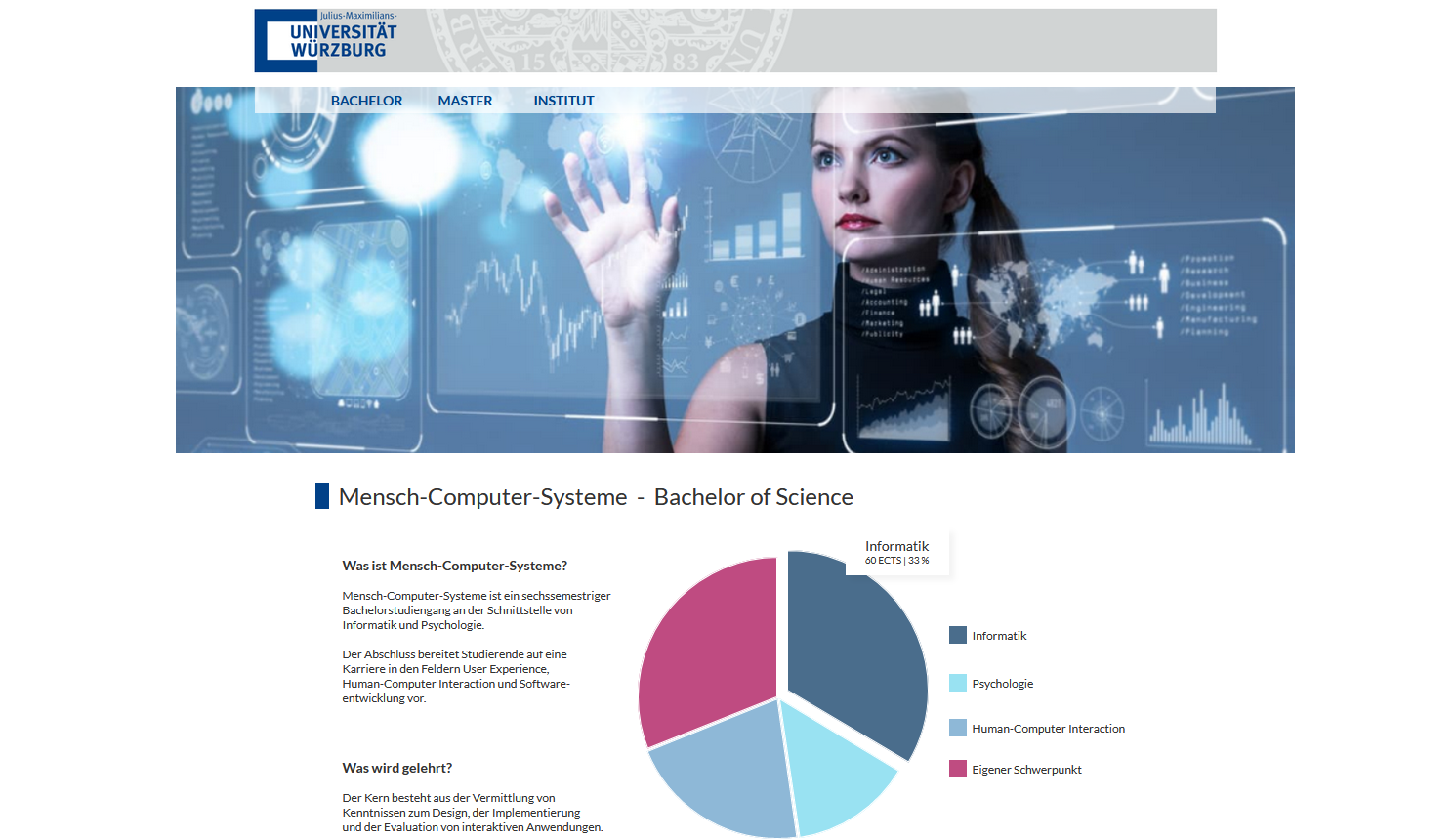
To improve the overall user experience, I put extra effort into the prototype’s usability (e.g. by ensuring every link and button is clickable as expected, without distracting from the main elements).
Besides that, I also made sure that all of the most important parts (the visualisations) adhered to common industry Interaction Guidelines, such as:
- Using simple charts and graphs over complex ones
- Showing only important and relevant info (This was a main focus, using the designing for progressive disclosure approach)
- Making reading aids available (such as tooltips)
- Starting the y-axis with 0 (to prevent overstating differences)
- Using a double y-axis (to improve overall readability)